Exhibition Breakpoints is a concept for a print-to-mobile digital museum platform using QR-codes.
Web Design
•
Frontend Development

Overview
Scope
Exhibition Breakpoints is an individual print-to-mobile student project.
The project required the design and implementation of a responsive app or website that is accessible on mobile devices via a QR code and offers real added value and benefits for users. The given scope was around 20 working hours.
Involvement
Web design, frontend development
Date
October 2023
Tools and Technologies
Figma, HTML, CSS, JavaScript, Webstorm
The Problem
A museum visit should be an enriching and inspiring experience, yet visitors often find themselves wanting more context when viewing artworks. Traditional plaques provide only limited information, typically listing the artist, title, and medium—especially for pieces that are part of a permanent collection rather than a themed exhibition. This lack of deeper insight can leave visitors feeling disconnected from the artwork and its historical significance.
Museums need a way to bridge this information gap and offer visitors a seamless, engaging, and informative experience without disrupting the traditional museum atmosphere. Additionally, there is potential to enhance visitor engagement by integrating relevant museum shop offerings, making art more accessible beyond the gallery walls.
A Concept For A Digital Museum
Objective
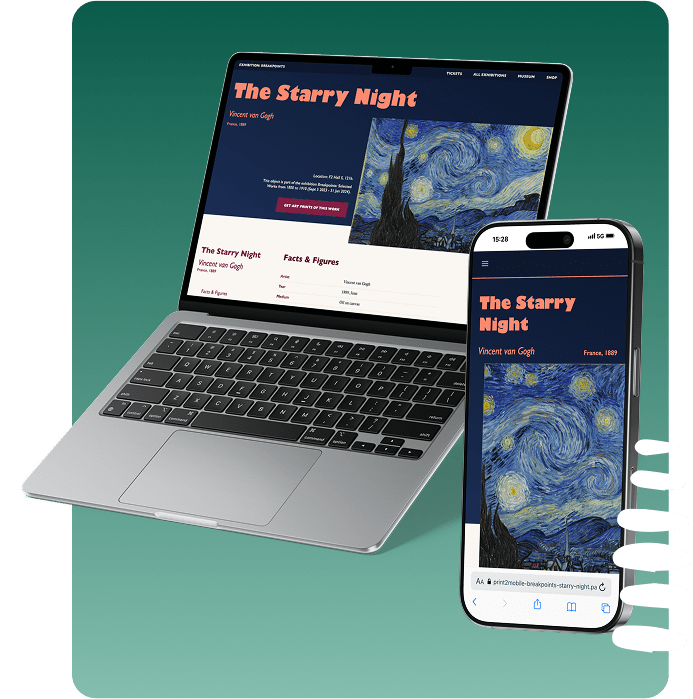
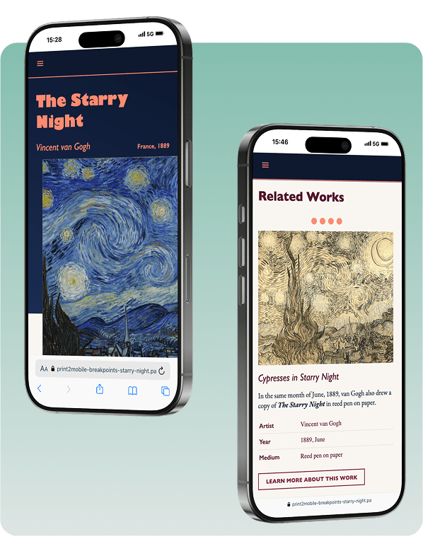
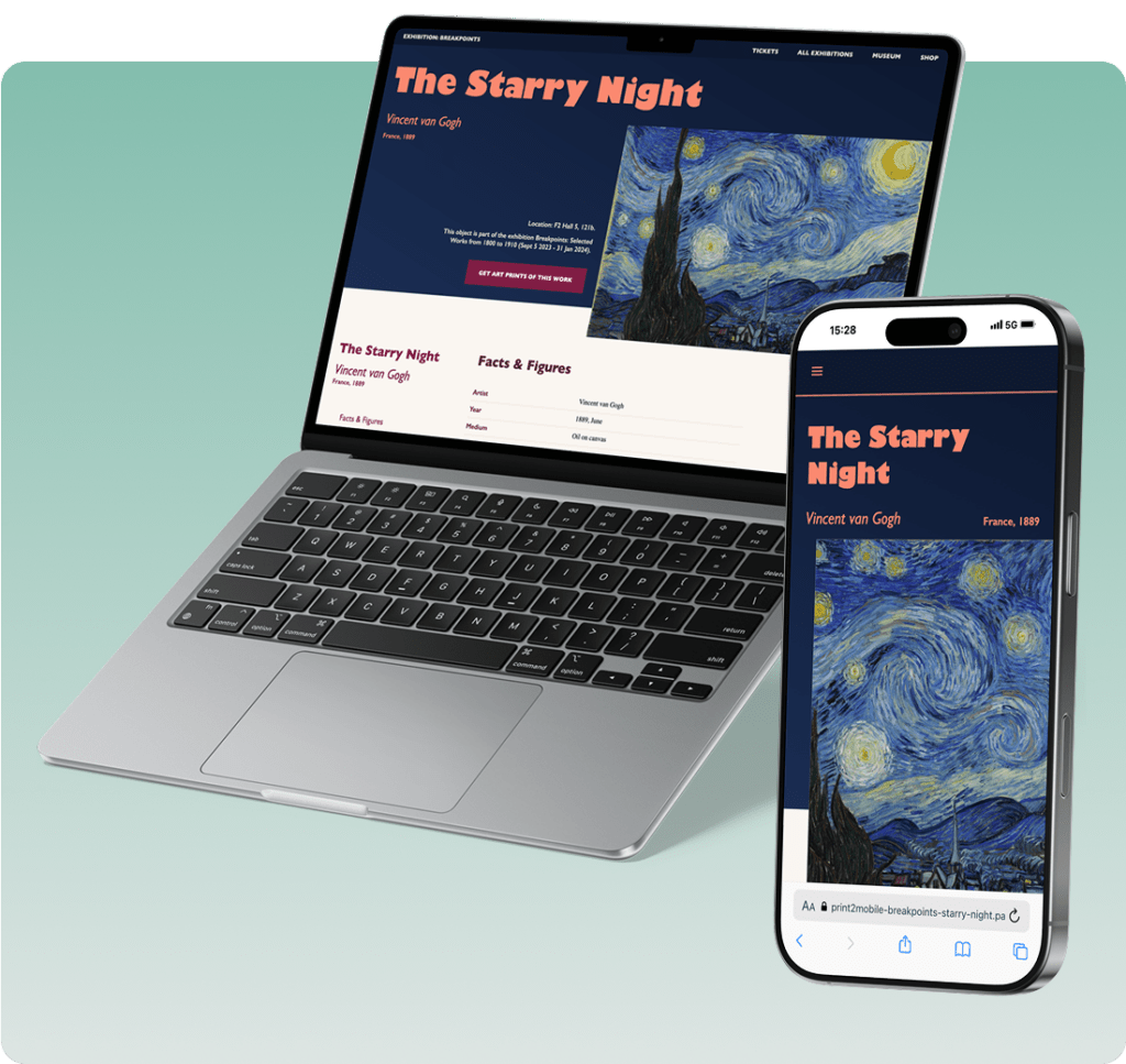
Exhibition Breakpoints is a responsive web app, accessible via QR codes placed on museum plaques, that enhances the visitor experience by providing rich, interactive content about artworks. By scanning the QR code, users can instantly access detailed information about the piece, including historical context, artist background, artistic movement, and engaging fun facts. Additionally, the platform connects visitors to related artworks and museum shop products, such as prints and exhibition catalogs, extending their engagement beyond the gallery space. Designed to align with the aesthetics of a fictional fine arts museum, the platform conveys values of culture, expertise, and trustworthiness, ensuring a seamless and visually coherent experience.
Due to the short project timeline, the website was developed as a static prototype using plain HTML, CSS, and JavaScript. While it does not include dynamic backend functionality, it effectively demonstrates the core concept and user experience envisioned for a fully realized version.
Target Users
The target users of Exhibition Breakpoints include museum visitors and art enthusiasts seeking deeper insights into artworks, artist biographies, and historical contexts. It also caters to casual visitors and tourists who may not have prior art knowledge but want a more engaging and interactive museum experience. Additionally, students and researchers benefit from the platform’s educational content. Lastly, museum professionals and curators can utilize the solution to enhance visitor engagement and integrate digital tools into their exhibitions.
By addressing the needs of these diverse user groups, Exhibition Breakpoints bridges the gap between traditional museum experiences and modern, interactive technology.
Researching Existing Solutions
In the next step, I conducted research to find out how other museums structured their digital concepts and offerings, as well as what functionalities and information they included. I searched for comparable projects and analyzed the following aspects:
- Comparable projects and analyzed the following aspects:
- Information architecture
- Visual appearance and UI design
- UX: positive aspects and areas for improvement
- Layout and structural composition
- Content and content organization
With the information I gathered, I was ready to make initial considerations for all these aspects of the project and subsequently create the first design drafts in the form of low-fidelity wireframes.
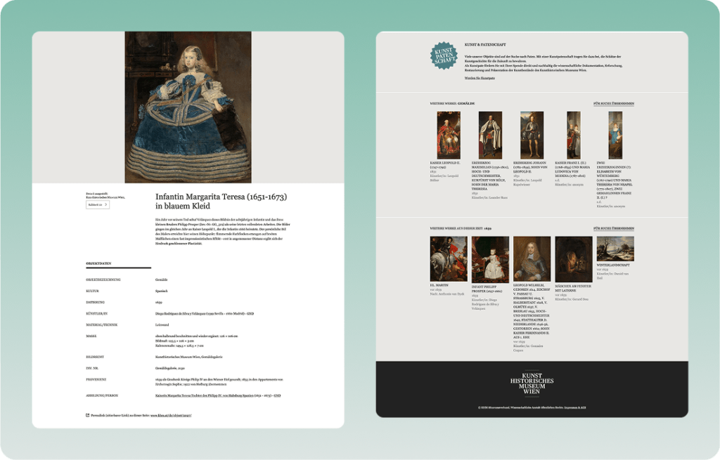
Research Example: KHM Vienna Digital Museum
Wireframing And Design
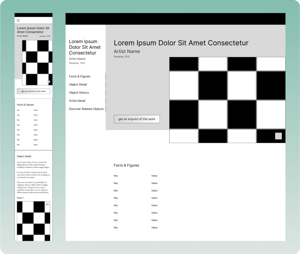
For this project, I focused on visual design. The website was designed following the mobile-first approach. As a first step, I created wireframes in Figma for the mobile view and then for the desktop view, initially concentrating on layout and structure.
Low-Fidelity Wireframes
Styleguide
Next, I defined the color scheme and typography. I chose a serif font for the body text to create the impression of a printed lexicon, encouraging users to browse through the content. For the accent colors, I selected midnight blue and burgundy to convey a sense of culture, expertise, and trustworthiness, while a gradation of light warm gray tones served as the foundation of the design.
Colors

Typography
High-Fidelity Design
A cropped section of the artwork was placed with a slight vertical offset, making it appear as if it is "hanging" from the header area and subtly protruding from the two-dimensional space. This design choice was intended to reflect the real-life experience of a visitor standing in front of an actual painting displayed on a museum wall.
As an example, I chose "The Starry Night" by Vincent van Gogh. This artwork is not only significant in European art history, marking the transition from Impressionism to Expressionism, but it also carries a rich and deeply emotional backstory—one that could never fully fit on a traditional museum plaque.
With the content and visual identity now defined, I proceeded to create the high-fidelity design.
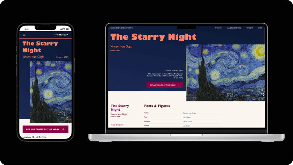
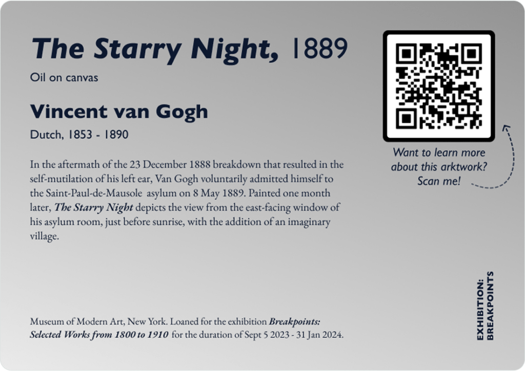
Museum Plaque
I also designed a corresponding exhibition plaque with an integrated QR-code. The plaque contains basic information about the artwork, as well as a call to action to scan the code for more in-depth information.
Development
Since I wanted to use this project to improve my CSS skills without relying on frameworks, I decided not to use one. My goal was to replicate the design as precisely as possible using only HTML and CSS. The result is a static yet fully responsive website. A sidebar allows users to navigate between different sections, and with a bit of JavaScript, the sidebar can be expanded and collapsed via the menu icon in the mobile view.
Possibilities for Improvement
Since the sidebar in the mobile view has to be closed manually after selecting a navigation item, a JavaScript function should be added to automatically collapse it. Additionally, the page feels quite static, so the overall look & feel could be improved with subtle animations, such as on scroll interactions. In terms of content, related links currently direct users to entries about similar or relevant artworks, but this could be expanded with additional articles for a more in-depth experience.
The End Result
The website is can be viewed online. Since the data and content are static and no backend connection to a database has been implemented, only a frontend is required.